Discover six extraordinary colorful buildings showcased in "Chromatic Architecture," illustrating how color can transform architectural perception and experience.
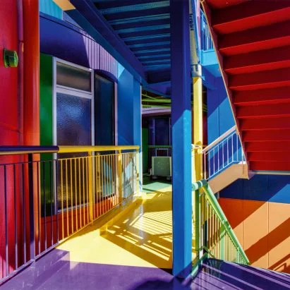
A new publication titled Chromatic Architecture, co-authored by designer Adam Nathaniel Furman and Dezeen contributor Kate Mazade, celebrates the impact of color in architecture through historical and contemporary examples. The book presents color not merely as decorative but as a fundamental aspect of architectural identity, shaping perceptions of space and human experience alike.
The Role of Color in Architecture
Through 34 exemplary projects, the authors illustrate color's role in expressing emotion, memory, and individuality. Many may still harbor the misconception that color in architecture undermines a design's seriousness. As Mazade points out, this misconception limits the potential of color to enrich architectural narratives. "We've curated case studies highlighting how color can infuse architectural works with emotional depth and cultural significance," she explains. With these words, the authors' intention becomes clear: they seek to deepen appreciation for how color shapes the built environment, aiming to serve as a reference for architects interested in vibrant design.
Color does more than beautify; it influences how people interact with buildings. Think about it. A striking facade or a colorful interior can evoke feelings ranging from joy to contemplation, significantly affecting the building’s role in its community. For architects, this understanding can offer new avenues to explore beyond conventional materials and design choices.
A Call for Courage in Design
Furman emphasized the often-unspoken affection for color within the design community, noting that many architects feel constrained in pursuing bold choices. "This book serves as a welcoming manifesto and a collection of high-quality examples, encouraging designers to embrace thoughtful chromatic strategies in their projects." His observation is more than just a commentary on preferences; it reflects a cultural hesitation. Many architects may feel pressured to conform to the minimalist trends that have dominated the industry for years. This reluctance can stifle creativity and reduce overall architectural vitality.
If you’re working in this space, consider the implications of this cautious approach. Is it stunting the vibrancy that public spaces could offer? The authors argue that embracing color could lead to spaces that foster community and engagement, offering a counter-narrative to sterile designs that prioritize uniformity over individuality.
Architectural Highlights of Chromatic Design
The authors selected six standout works of colorful architecture, each demonstrating unique uses of color:
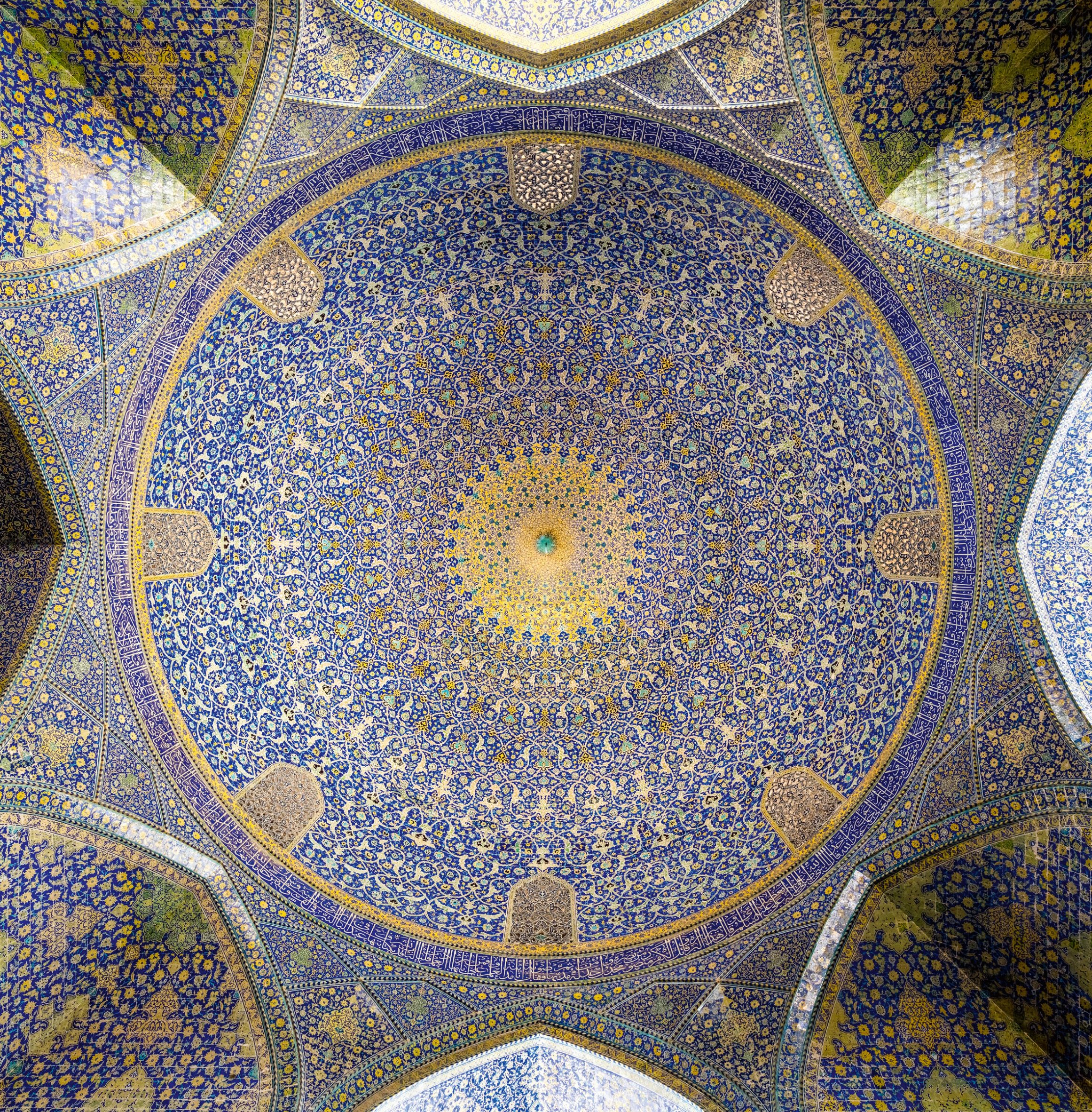
Shah Mosque, Isfahan, Iran, by Ali Akbar Isfahani, 1629
"This mosque exemplifies the artistry of glazed tiles that redefine spatial complexity," remarked Furman. The blue tiles intricately woven into the structures challenge perceptions of space, elevating the viewer's emotional response. Its design compels admiration and reflection, highlighting how historical structures can continue to inform modern architectural practices.
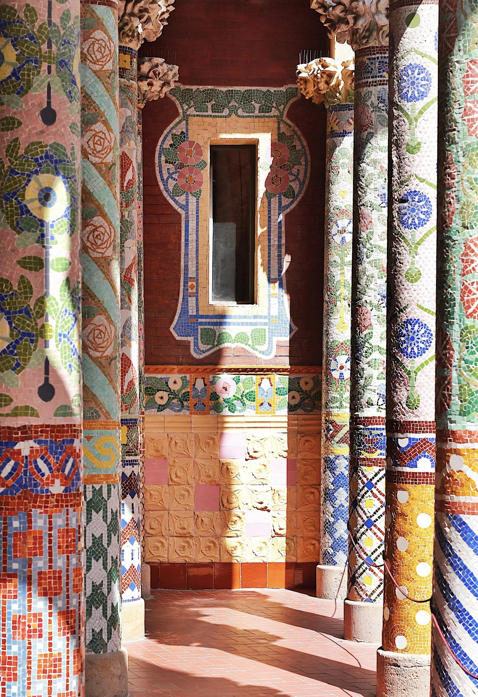
Palau de la Música Catalana, Barcelona, Spain, by Lluís Domènech i Montaner, 1908
Furman hailed this structure as a masterclass in integrating mosaic, stained glass, and other materials. The design blurs the line between architecture and artistry, creating a dynamic experience for visitors. This approach serves as a reminder of how architecture can serve multiple functions—functional, aesthetic, and emotional—signifying a holistic experience that sharpens public engagement.
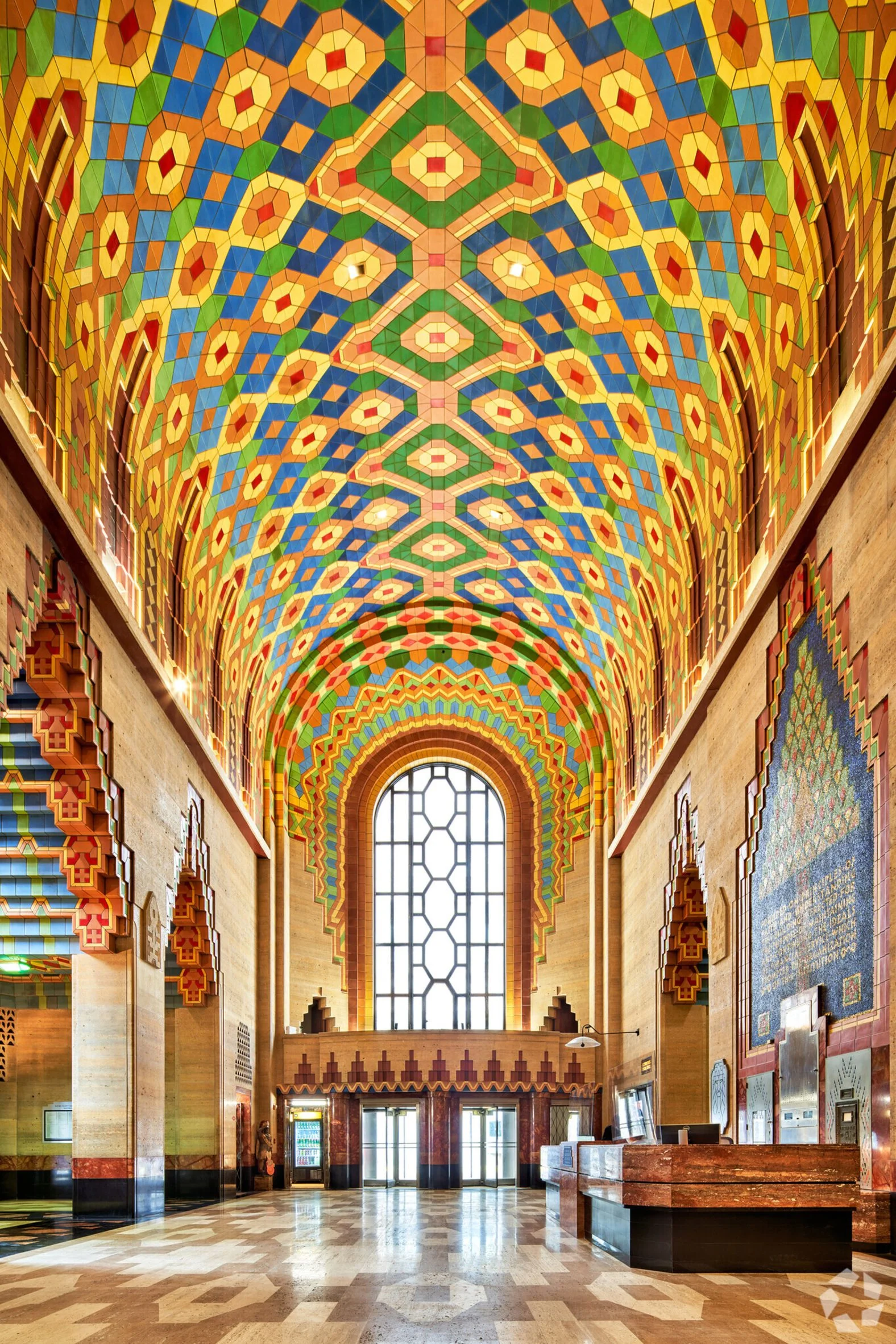
Guardian Building, Detroit, USA, by Wirt C Rowland, 1929
"This building is a pinnacle of art deco color use," Furman noted. Its glazed terracotta and stone elements reveal how color can be fundamental to a building's identity. This connection between color and identity is particularly significant in today’s urban settings where individuality often gets lost amidst monotony.
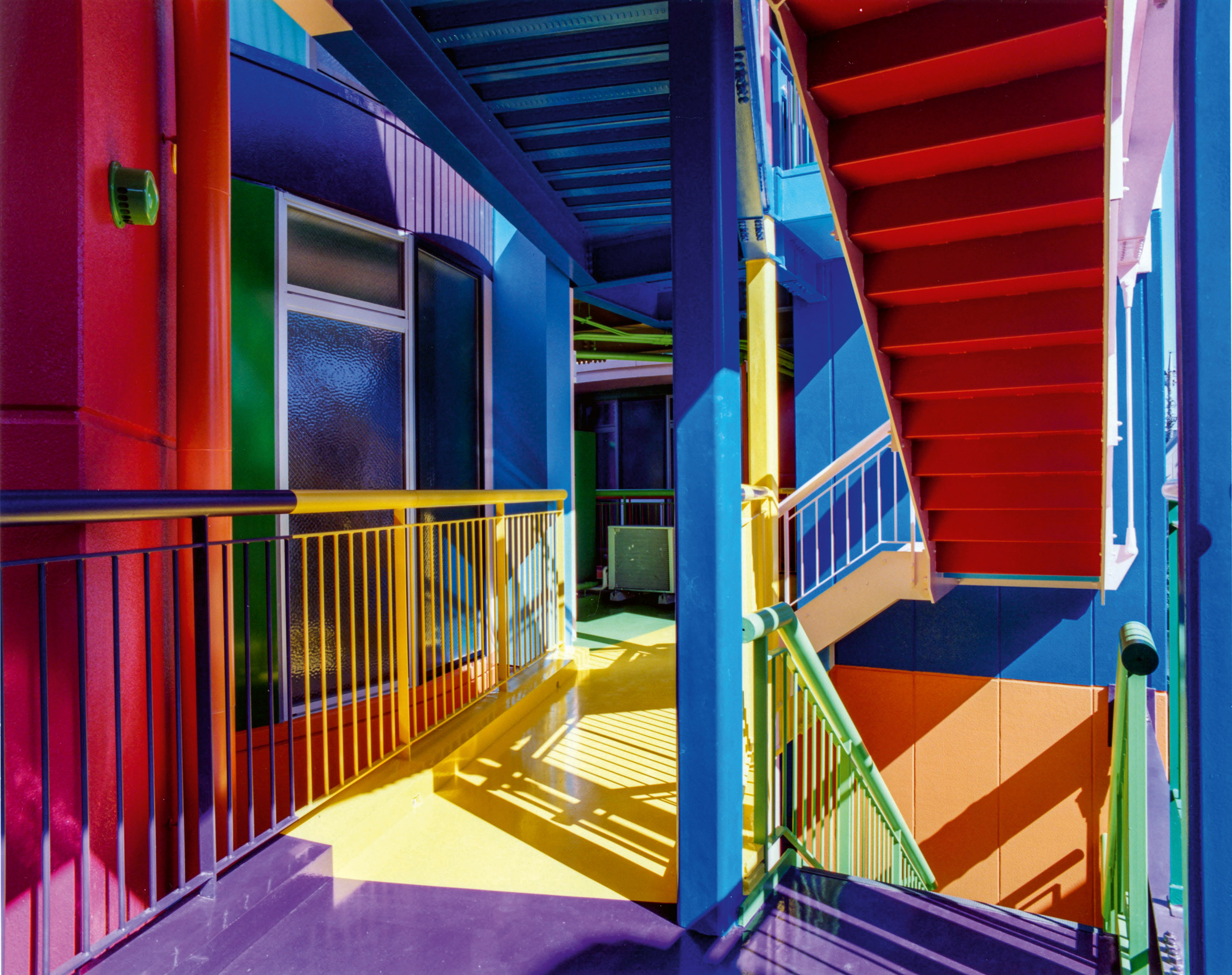
Reversible Destiny Lofts, Tokyo, Japan, by Shusaku Arakawa and Madeline Gins, 2005
Furman described these lofts as challenging traditional notions of residential spaces. Their high-contrast color strategy provokes an enhanced awareness among its residents, marking color as a catalyst for engagement. In a populous metropolis like Tokyo, where residents are often disconnected from their environment, this approach fosters a deeper sense of community and belonging.

Croydon Colonnade, London, UK, by Adam Nathaniel Furman, 2023
Furman's personal project seeks to leverage handmade ceramics to inject vibrant color into a public space, aiming to infuse joy and tactile curiosity into urban life. This initiative is a testament to how contemporary architects can reimagine traditional materials into vivid expressions, bringing life and personality to otherwise mundane public settings.
The Implications of Embracing Color in Architecture
The insights drawn from Chromatic Architecture encapsulate both a celebration of color and a call to action for architects to integrate it artfully in their designs. The movement toward integrating color goes beyond aesthetics; it embodies a broader debate about the role of architecture in society. In a world increasingly marked by monochrome buildings and sterile urban environments, the choice to employ color can challenge the status quo.
Here's the thing: Buildings do more than shelter—they represent communities, histories, and aspirations. When architects prioritize color, they invite a dialogue, encouraging people to interact with the spaces around them. This book is a mirror reflecting the potential in colors, urging designers not to shy away from expressing individuality through their work.
What this means for you as an architect or a designer is that exploring color is not just a creative endeavor; it’s a responsibility toward the built environment. The ongoing explorations of color in architecture are not merely decorative but deeply meaningful, offering insights into human experiences that are inherently tied to where we live and work.
Discussion
Sign in to join the discussion.